Gallery / Statistical summaries
density
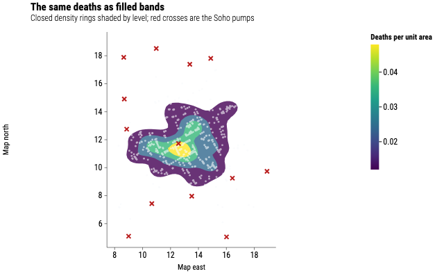
Cholera deaths as filled density bands
The same 1854 Soho map, with the density drawn as closed bands rather than lines: the darkest band covers the streets fed by the Broad Street pump.
Source
Svelte, builder, JSON
<script lang="ts">
  import {
    CoordFixed,
    GeomDensity2dFilled,
    GeomPoint,
    GGPlot,
    Labs,
    ScaleXContinuous,
    ScaleYContinuous,
    ThemeClassic,
  } from "@ggsvelte/svelte";

  import { choleraDeaths, waterPumps } from "./data.js";
</script>

<GGPlot data={choleraDeaths} aes={{ x: "x", y: "y" }} width={640} height={400}>
  <ThemeClassic />
  <CoordFixed />
  <ScaleXContinuous breaks={[8, 10, 12, 14, 16, 18]} />
  <ScaleYContinuous breaks={[6, 8, 10, 12, 14, 16, 18]} />
  <Labs
    title="The same deaths as filled bands"
    subtitle="Closed density rings shaded by level; red crosses are the Soho pumps"
    x="Map east"
    y="Map north"
    fill="Deaths per unit area"
  />
  <GeomDensity2dFilled bins={6} n={48} alpha={0.8} />
  <GeomPoint alpha={0.6} size={1.4} aes={{ color: { value: "#f8fafc" } }} />
  <GeomPoint
    data={waterPumps}
    aes={{ x: "x", y: "y", color: { value: "#b91c1c" } }}
    size={4}
    shape="cross"
  />
</GGPlot>
Meta
Details
- Family
- Statistical summaries
- Source
density/kde-2d-filled- Rendering
- SVG
- Techniques
Related