Gallery / Scatter plots
point
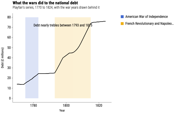
What the wars did to the national debt
Playfair's debt series with two war periods behind it and one note on top, each layer carrying its own table because only one of the three is a measurement.
Source
Svelte, builder, JSON
<script lang="ts">
  import {
    GeomLine,
    GeomRect,
    GeomText,
    GGPlot,
    Labs,
    ThemeClassic,
  } from "@ggsvelte/svelte";

  import { callouts, nationalDebt, warYears } from "./data.js";
</script>

<GGPlot width={640} height={400}>
  <ThemeClassic />
  <Labs
    title="What the wars did to the national debt"
    subtitle="Playfair's series, 1770 to 1824, with the war years drawn behind it"
    x="Year"
    y="Debt (£ millions)"
    fill=""
  />
  <GeomRect
    data={warYears}
    aes={{
      xmin: "xmin",
      xmax: "xmax",
      ymin: "ymin",
      ymax: "ymax",
      fill: "war",
    }}
    alpha={0.18}
  />
  <GeomLine
    data={nationalDebt}
    aes={{ x: "year", y: "debt" }}
    linewidth={1.8}
  />
  <GeomText
    data={callouts}
    aes={{ x: "year", y: "debt", label: "label" }}
    size={12}
  />
</GGPlot>
Meta
Details
- Family
- Scatter plots
- Source
point/layer-data-bands- Rendering
- SVG
- Techniques
Related