Gallery / Rectangles & grids
rect
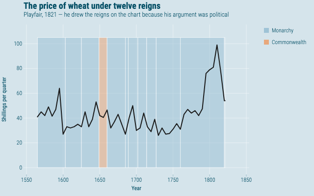
The price of wheat under twelve reigns
Playfair's wheat series with each monarch's reign drawn as a shaded band behind it, the way Playfair drew them himself.
Source
Svelte, builder, JSON
<script lang="ts">
  import {
    GeomLine,
    GeomRect,
    GGPlot,
    Labs,
    ScaleFillManual,
    ScaleXContinuous,
    ThemeEconomist,
  } from "@ggsvelte/svelte";

  import { reigns, wheatPrices } from "./data.js";
</script>

<GGPlot data={reigns} width={640} height={400}>
  <ThemeEconomist />
  <ScaleXContinuous labels="d" />
  <ScaleFillManual
    domain={["Monarchy", "Commonwealth"]}
    values={["#9ec3d6", "#e8a87c"]}
  />
  <Labs
    title="The price of wheat under twelve reigns"
    subtitle="Playfair, 1821 — he drew the reigns on the chart because his argument was political"
    x="Year"
    y="Shillings per quarter"
    fill=""
  />
  <GeomRect
    aes={{
      xmin: "start",
      xmax: "end",
      ymin: "ymin",
      ymax: "ymax",
      fill: "rule",
      color: { value: "#ffffff" },
    }}
    alpha={0.55}
    linewidth={1}
  />
  <GeomLine
    data={wheatPrices}
    aes={{ x: "year", y: "shillings", color: { value: "#1a1a1a" } }}
    linewidth={2}
  />
</GGPlot>
Meta
Details
- Family
- Rectangles & grids
- Source
rect/regions- Rendering
- SVG
- Techniques
Related